Rec Room Content Discovery
Helping players find their next favorite game

Context
With millions of rooms and new ones arriving daily, finding the right content in Rec Room had started to feel like searching for a gem in a haystack. The recommendation feed felt stale, the UI was creating decision fatigue, and new creators were getting buried. Time spent in rooms was declining.
I embedded myself into the Discovery team — which had no designer — and led the work end to end: scoping, research, design, A/B testing, and building a scalable UI framework that outlived the project.
Engagement up. Chaos down.
Triangulating the right problems to solve
I partnered with UXR to survey 700+ players. I wanted to make sure we were solving the right problem, not just the most obvious one.
- 70% felt recommendations barely changed between sessions
- 64% wanted to see rooms that were new or recently updated
- 50% were curious what their friends were playing
The problem had three faces: players hit decision fatigue, new creators couldn't get traffic, and the platform flywheel was slowing. All three traced back to the same root — the discovery surface wasn't giving players the right signals.
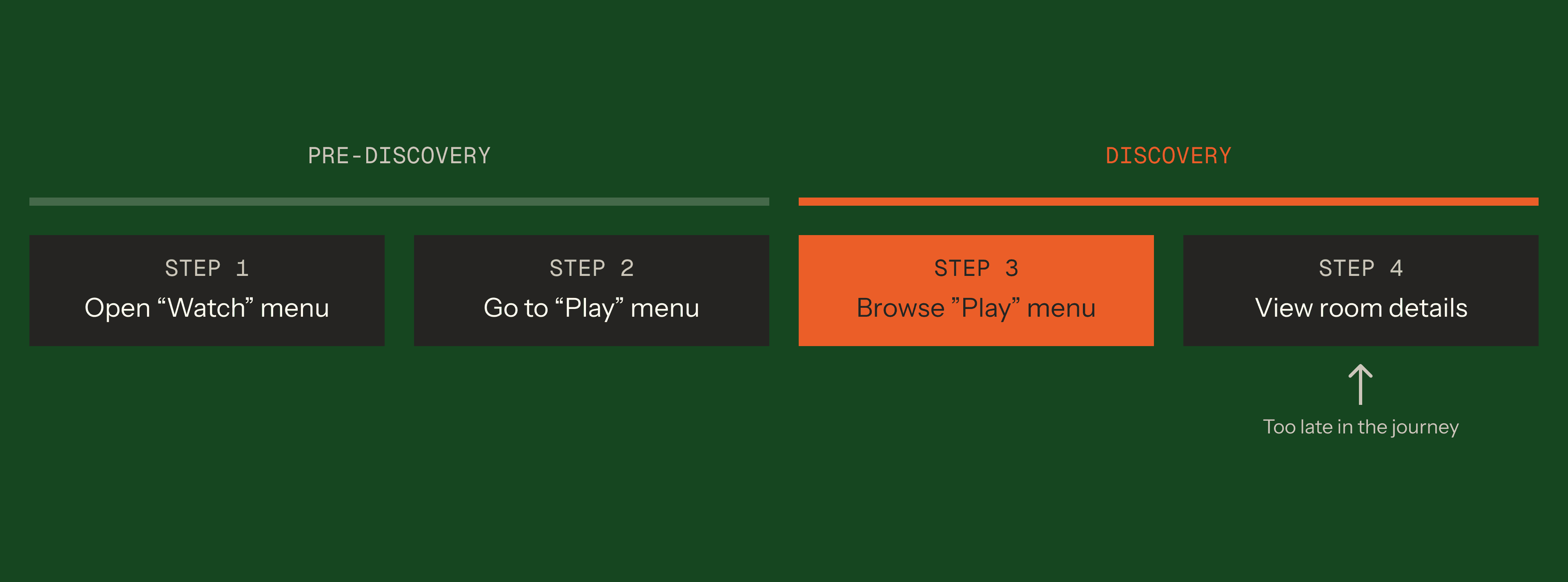
I also scoped deliberately to the Play menu. Room detail was too late in the journey. Pre-navigation was too upstream. The highest-leverage surface was exactly where players were deciding what to play.
Making freshness visible
After syncing with engineers, I learned that the algorithm was already refreshing content after every game session, which means it was a perception problem, not an algorithm problem.
To make content freshness visible, I first explored adding a corner bubble to room cards. It immediately felt anxiety-inducing—like unread text messages.
What we needed was something subtle and ephemeral. I pivoted to micro-interactions: a sparkle, an animated border, and finally, a shimmer effect.
Players overwhelmingly preferred the shimmer. One mentioned it felt like “wiping clean a dusted window”.
We A/B tested it and shipped a 4.7% increase in time spent in rooms and a 2.5% increase in visits.
Exploration 4: Shimmer
Less is more means removing the sacred metrics
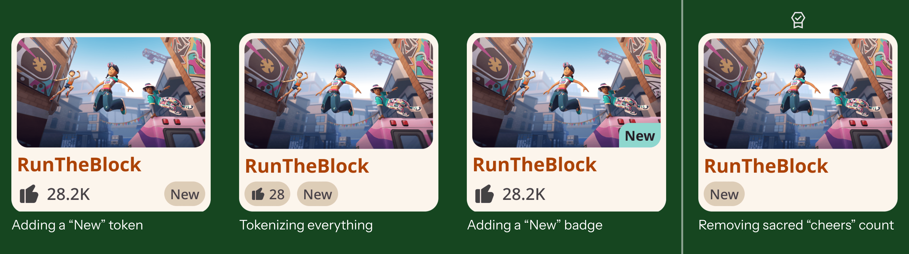
64% of the players wanted to find new rooms. I started with moving the exisiting "New" tab and carousel to more prominent positions. The time spent in new rooms went up slightly, but overall time spent went down.
Then I started to integrate “New” indicators directly into the room cards. I designed four variants.
It turned out the winning variant was the most controversial: completely removing the room's lifetime “cheer count” and replacing it with a clean “New” token, which led to a 5.5% increase in visits and 6.5% increase in time spent.
This proved that showing the lifetime cheer count was biasing players towards older rooms, not better rooms.
A framework for the future
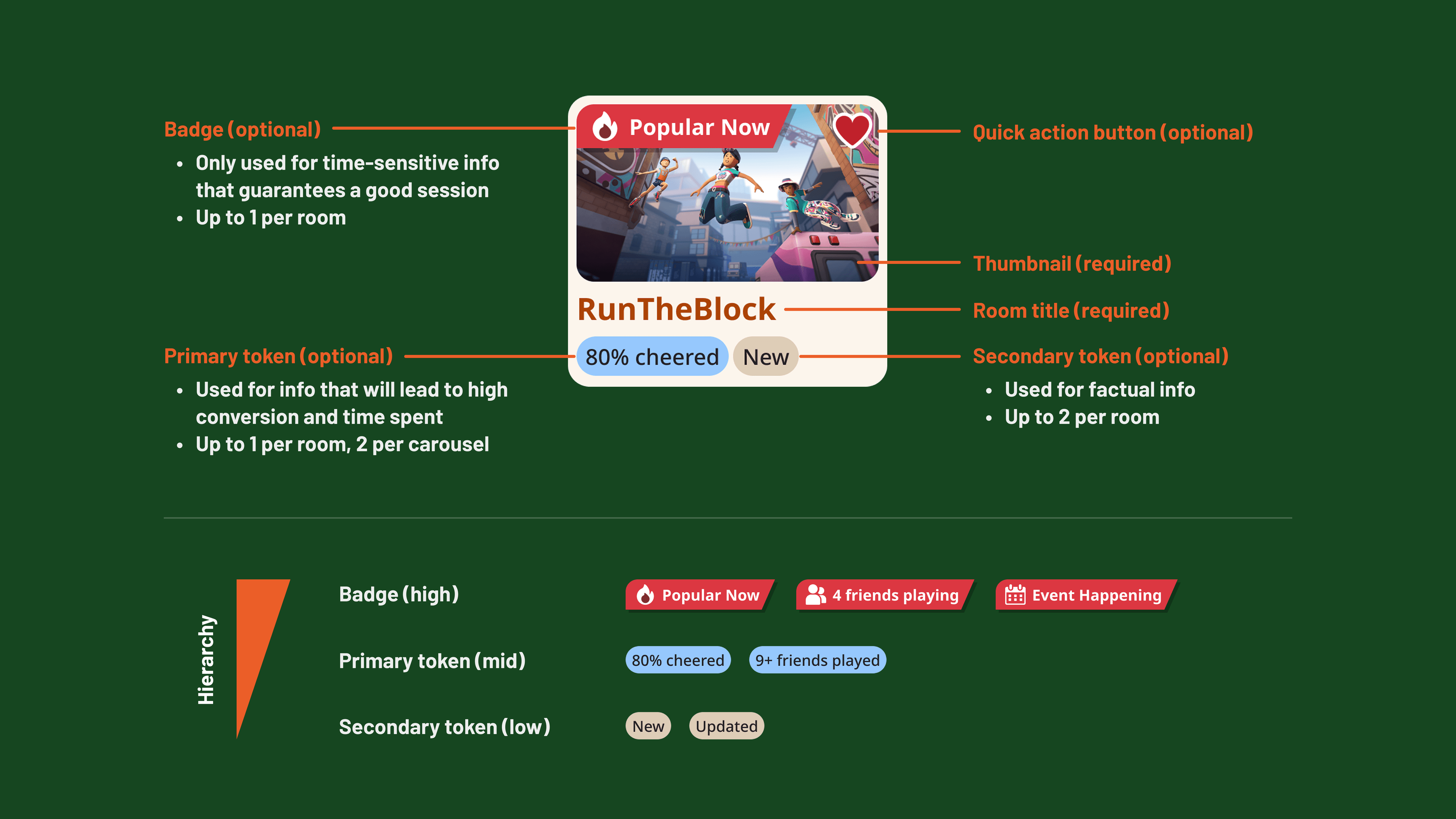
The room card is the most important component in our ecosystem, but it lacked guidelines. With more space opened up, I started to collaborate with different teams and establish a scalable UI framework for room cards.
To prevent congnitive overload and improve conversion, I further established a strict hierarchy:
- Badges (High): Used for displaying time-sensitive information that guarantees a satisfactory game session. Up to 1 allowed per room.
- Primary Tokens (Mid): Used to highlight information that will lead to high conversion and time spent. Up to 1 allowed per room.
- Secondary Tokens (Low): Used to display factual information about the room. Up to 2 allowed per room.
A broader picture
Throughout this project, I scoped deliberately to the Play menu — that's where the highest leverage was. But I kept thinking about the step right after it.
The Room Details page — the final moment before a player joins a room — had its own structural problems: no meaningful information above the fold, no differentiation between new and returning players, and a similar rooms carousel placed before the description, essentially inviting players to leave before they'd decided to stay.
So I put together a vision doc and a set of mockups for a full overhaul. We couldn't get the cycles due to shifted company priorities. But the problem is real, and it's exactly the kind of problem I'd be excited to pick back up.
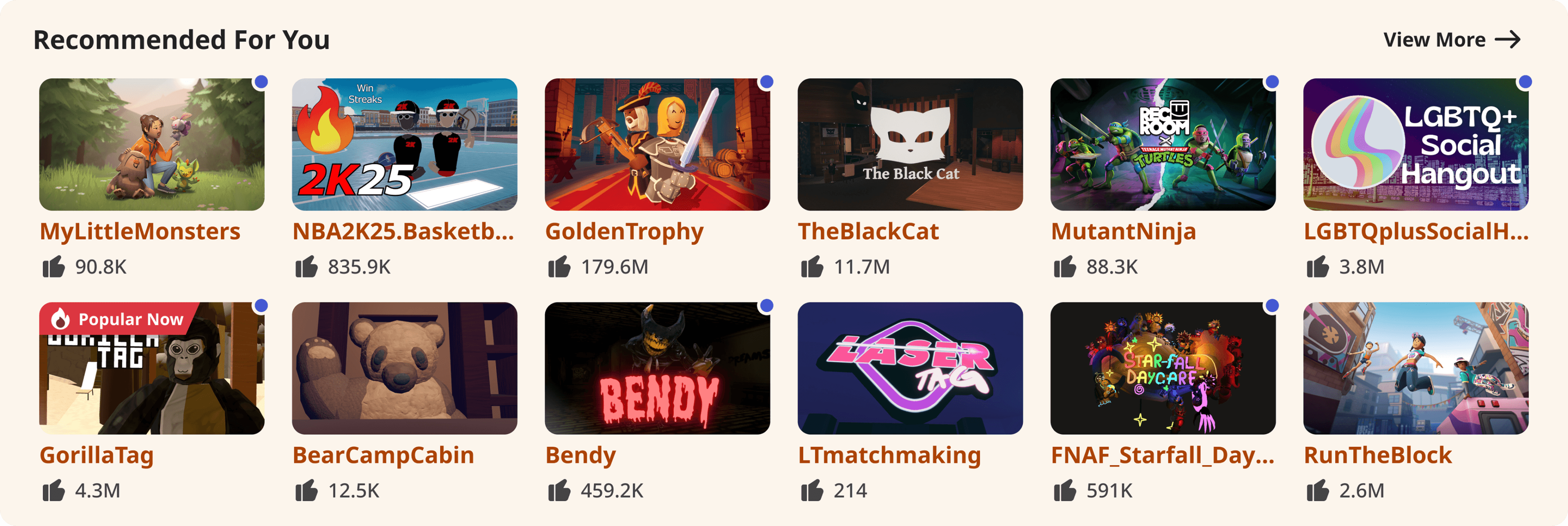
Landing page should show more content that players care about
Curious to learn more?
Reach out to learn more about this project, or me, as a future partner at work ;)
