Rec Room Creator Stats
Building a 0-1 dashboard that became the growth engine for 50K+ creators

Context
Rec Room runs on user-generated content. The creators are the engine the whole platform depends on. In 2023, however, the flywheel was slowing down because creators had no way to know how their creation was performing. I embedded myself, as the only product designer, into the Creator Ecosystem team to deliver the end-to-end design solution.
RoleLead Product Designer
Team1 PM | 3 Engineers | 1 UXR | 1 Data Scientist | 1 QA
PlatformWeb, Responsive
SkillsProduct Strategy | UX/UI Design | Vibe-Coding | Interactive Prototyping | Information Architecture | UX Research & Testing | Design Systems | Cross-Functional Leadership
TimelineProject: Jan '23 – Jan '24
Vibe-Coding Prototype: Apr '26
Vibe-Coding Prototype: Apr '26
Prototype Coded by MeView Prototype
Impact
Hitting every target
Time spent creating
Goal: + 10%
Result: + 32.5%
Content Performance Improvement
Goal: + 5%
Result: + 38.7%
% of Creators Who Edit After Viewing Stats
Goal: 25%
Result: 53.1%
Status Quo
Overhaul, or build from scratch?
The existing dashboard was accumulated with new pages stacked on top of old ones. Most creators assumed it was a payment tool and never opened it again.
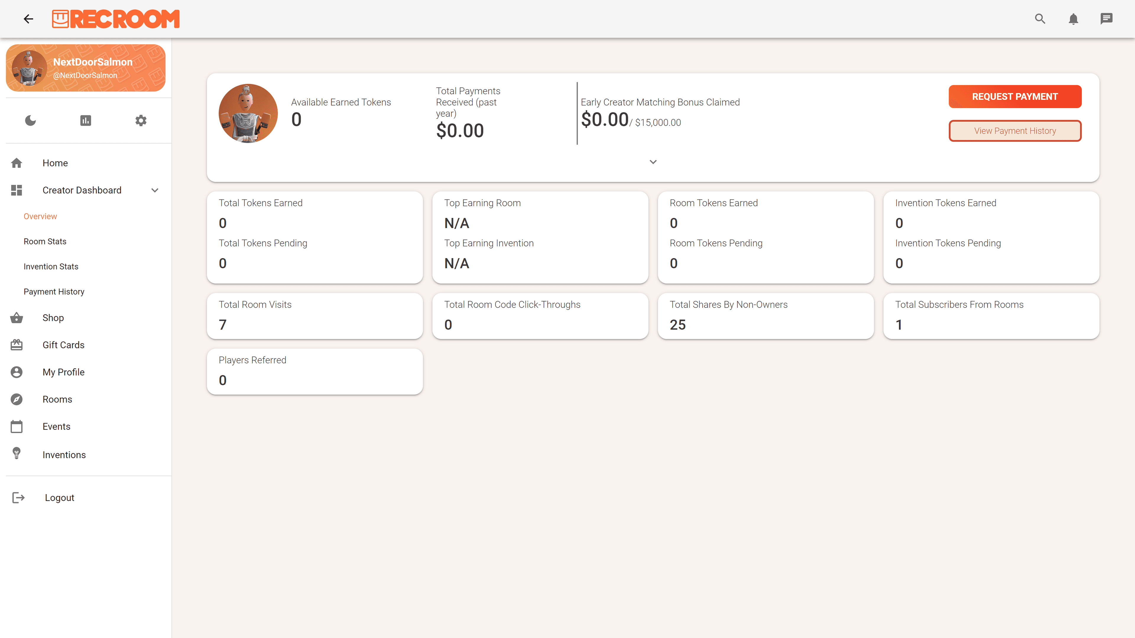
I pushed back on adding more stats to the existing structure.
Three things made it clear we needed to start over:
- Misleading and fragmented information architecture
- No responsive design, though 62% of creator traffic came from mobile
- “Alert-heavy” color system
Reframe
Creators needed a compass, not a mirror
I partnered with the UXR team to survey 600+ power creators and run one-on-one sessions and realized creators didn't need a reflection of their performance. They needed something that pointed toward how to improve it.
I brought that reframe to the PM. We walked out with a shared vision:
I brought that reframe to the PM. We walked out with a shared vision:
Specifically, I had 2 principles in mind:
- Signal for all. Every creator, regardless of what they build, lands somewhere immediately useful.
- Depth on demand. From there, each creator goes deep on exactly what they care about.
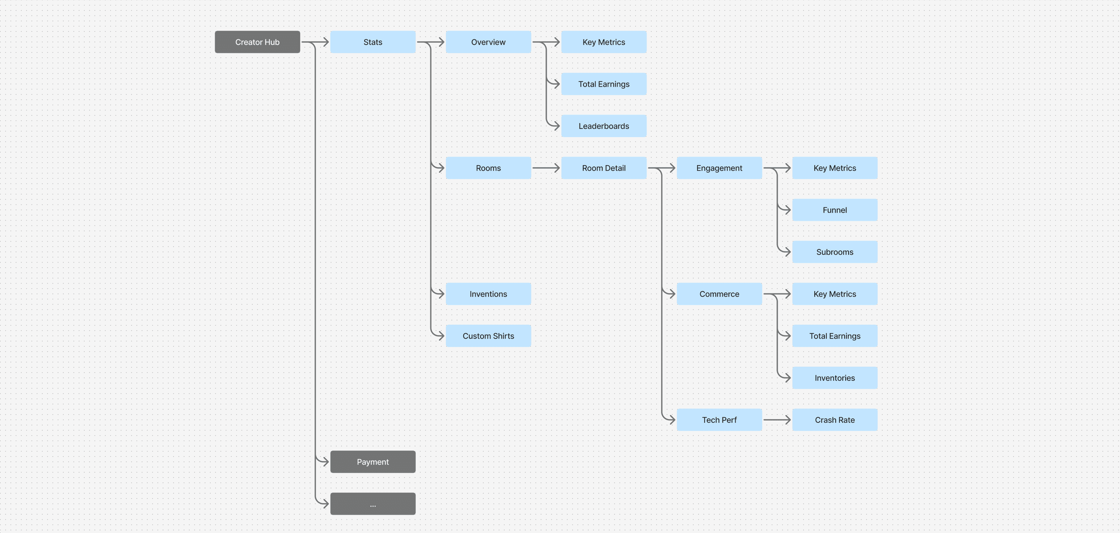
System
Pushing for a design system nobody asked for
As I mapped out the full product, I could see the same components repeating across every page. I made the case for building them once, properly.
It took some convincing but it paid off. The Tech Performance page, one of the most complex in the product, went from design to shipped in under two weeks.
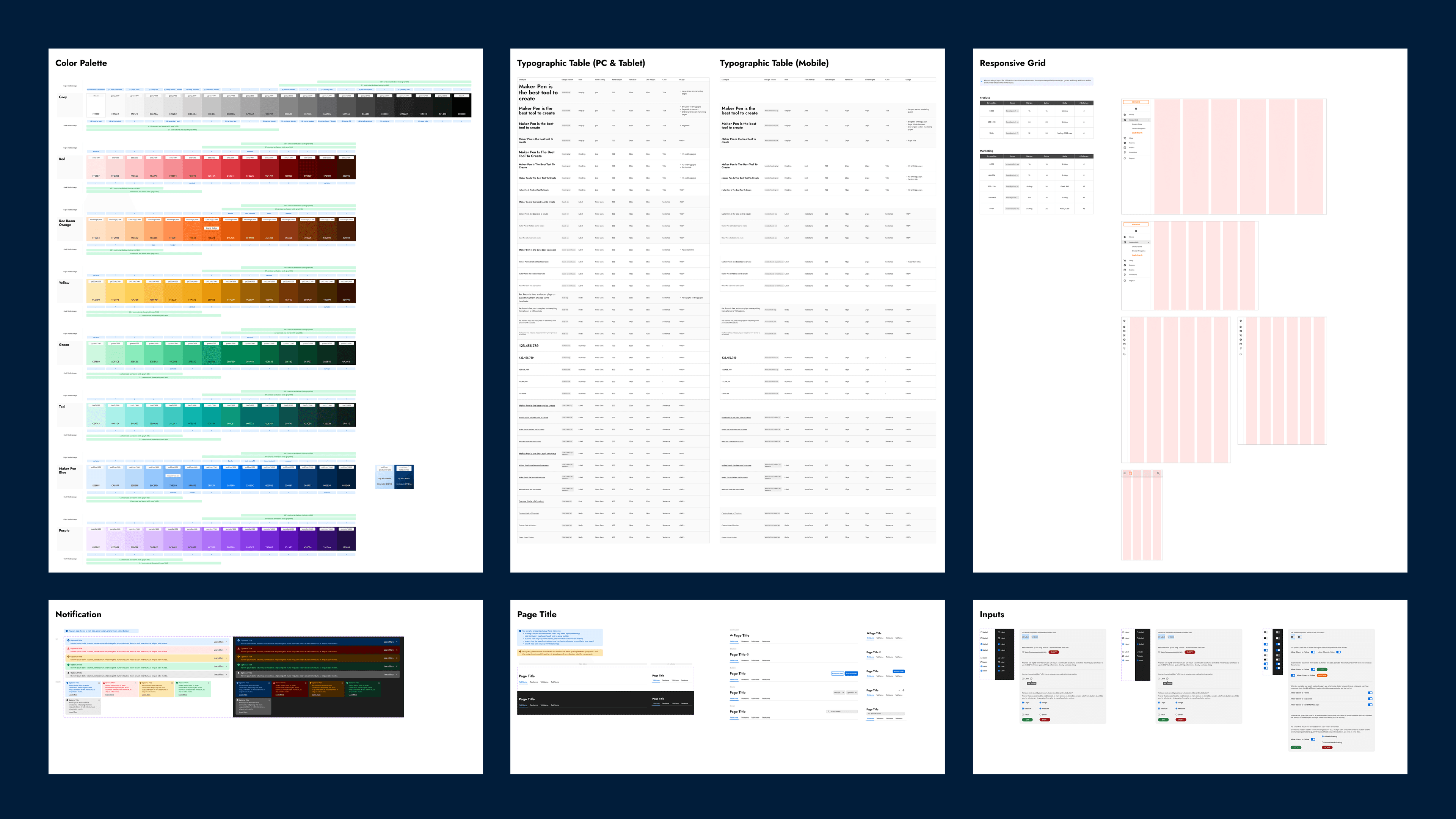
- Light and dark mode across every component
- Three responsive breakpoints
- A dynamic typography system that automatically converts desktop font sizes to appropriate mobile sizes
It took some convincing but it paid off. The Tech Performance page, one of the most complex in the product, went from design to shipped in under two weeks.
Design / Overview
Breadth first. Depth on demand.
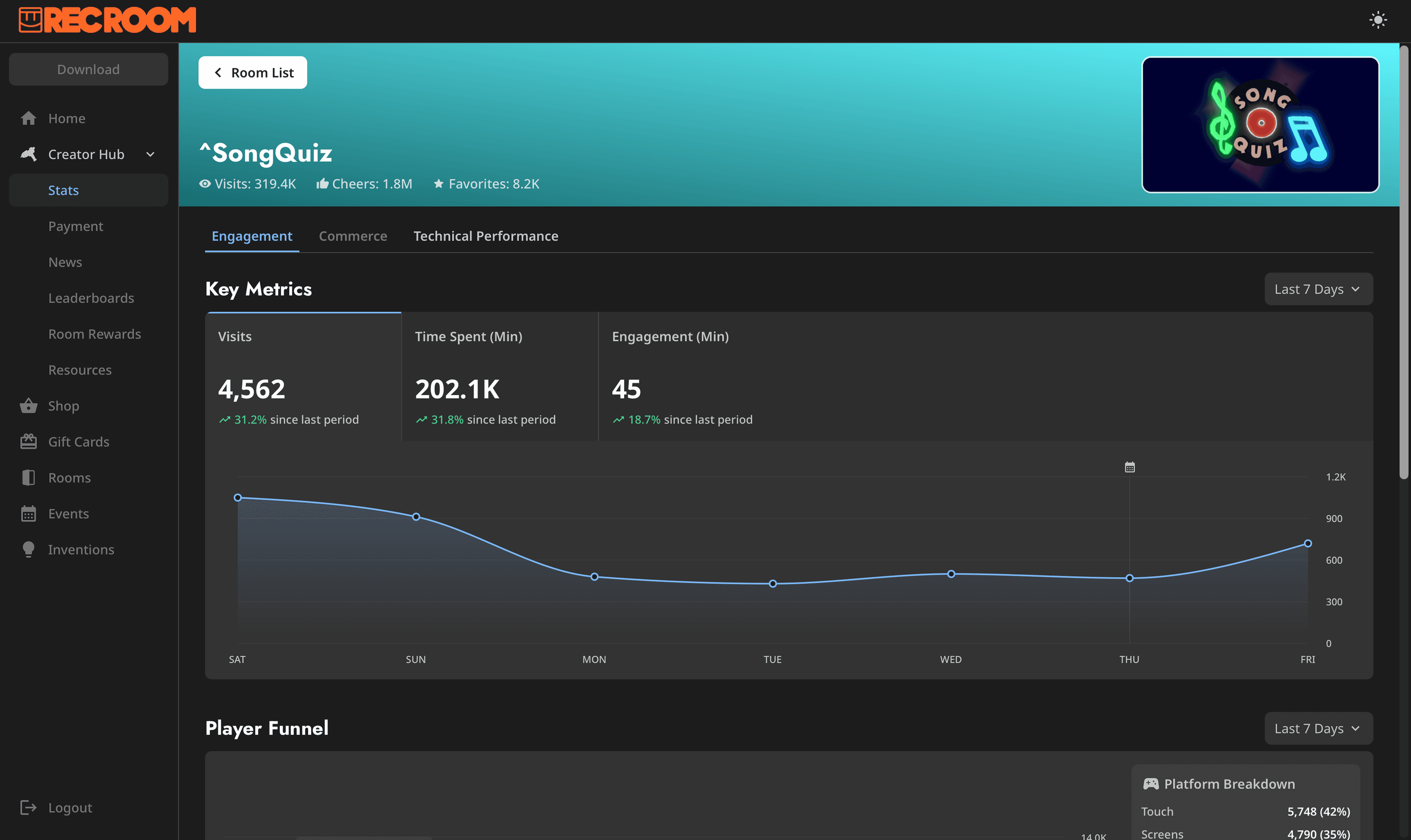
The overview page is where every creator lands. Three topline metrics at the top: Visits, Time Spent, Tokens Earned, each with a color-coded trend. The first thing you see tells you what's working and what isn't.
Earnings sit below the metrics, not above them. The old dashboard led with cashout. A small shift in hierarchy to quietly reshape how creators perceive the product.
Earnings sit below the metrics, not above them. The old dashboard led with cashout. A small shift in hierarchy to quietly reshape how creators perceive the product.
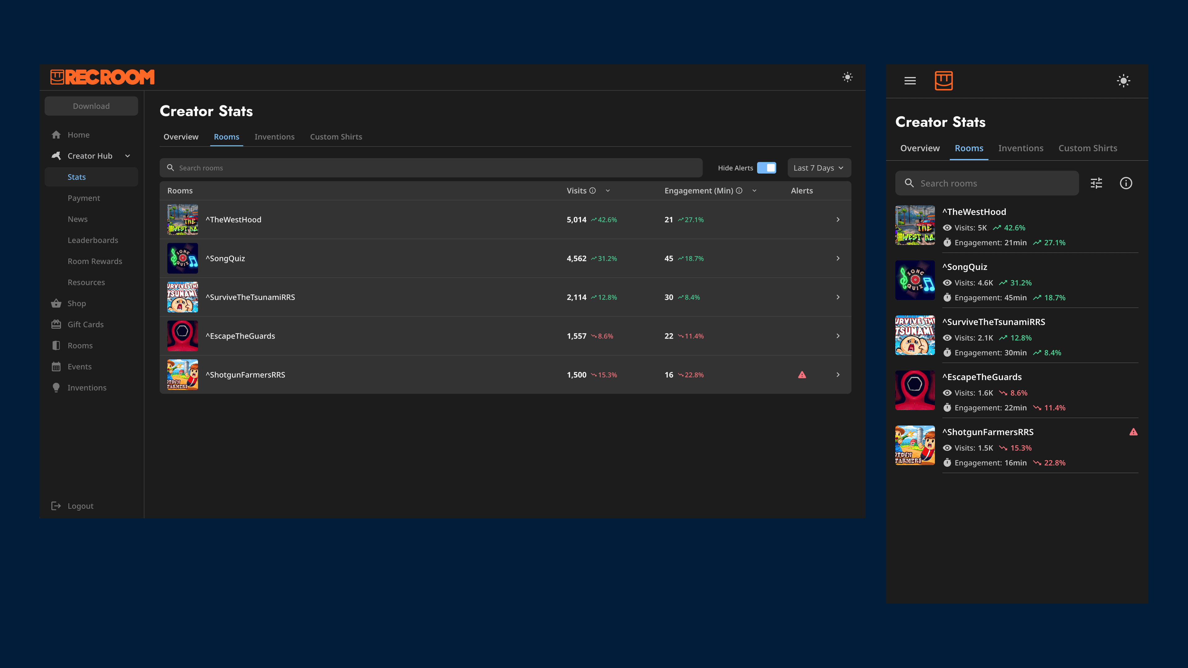
Design / Rooms
Density for desktop, clarity for mobile
On desktop, a data table gives power creators the density they need. On mobile, that same data becomes a clean list with no horizontal scrolling. 62% of creator traffic is on mobile. The layout adapts to how people actually use it.
Design / Room Detail
Colors that do actual work
Data dashboards don't have to be sterile.
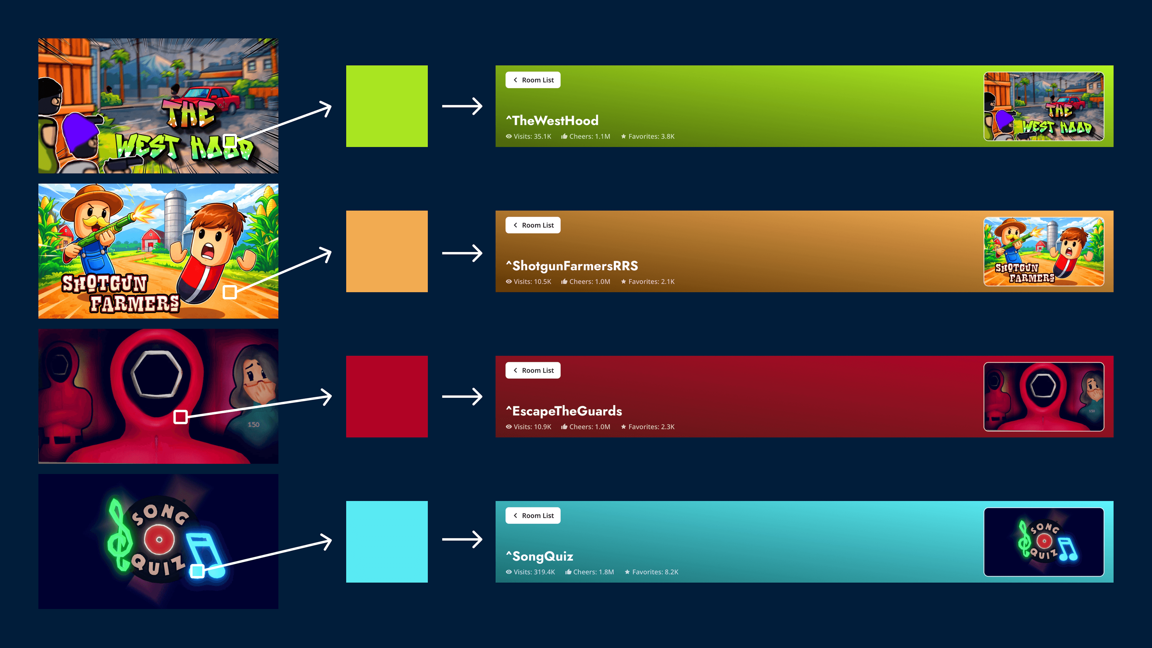
Every room gets a dynamic gradient auto-generated from its cover image. It isn't just decorative. During side-by-side comparisons, the color acts as an instant identifier. You don't have to read the room name to know what you are looking at.
Every room gets a dynamic gradient auto-generated from its cover image. It isn't just decorative. During side-by-side comparisons, the color acts as an instant identifier. You don't have to read the room name to know what you are looking at.
Design / engagement
Unearthing cause and effect
Small event icons mark specific dates on the key charts. Hover over a dip and you see: that's the day I pushed changes. That connection between action and outcome is the feedback loop creators were asking for.
Design / Performance
From alert to action
A new platform policy was coming: rooms with crash rates above a certain threshold would be removed from the recommendation algorithm. Creators needed to know before it happened, and they needed to be able to act.
Three cards. One per platform: Touch, VR, and Screen. You know which platform went wrong, how bad it is, and what's happening to your room because of it.
An FAQ and news section sit directly on the page. Creators can go from "my room is being de-ranked" to "here's what I'm doing about it" without leaving.
When a room has a performance issue, it surfaces to the top of the room list automatically. Click in and you land directly on the Tech Performance tab.
Impact
A True Help
In our post-launch sessions, we watched creators look at their charts, switch back to their rooms, and make changes. Nobody told them to. They just did it.
Products that don't just inform people, but move them to a better place. That's what I'm always trying to get to.
Curious to learn more?
Reach out to learn more about this project, or me, as a future partner at work ;)
